Overview
Designing Stillness in a Noisy World — My Role in the Storyfaith Mobile App Redesign
When Storyfaith approached me, they had a clear vision: help people stay spiritually grounded between Sunday services. But their mobile app wasn’t living up to that promise. It was cluttered, hard to navigate, and lacked a clear rhythm for users to follow. My job was to reimagine the experience — making it simpler, more intentional, and more personal.
Understanding the Mission
Storyfaith’s purpose is deeply human — providing a space for stillness, reflection, and connection with faith in daily life. To design for something so personal, I first had to immerse myself in the world of their users.
I started with interviews and empathy mapping, listening to how people described their day-to-day spiritual struggles. The recurring theme? Life felt too fast, too noisy. People wanted a guide, not another stream of overwhelming content.
Finding the Gaps
The existing app buried its most valuable features under multiple taps, and content felt disconnected from each user’s personal journey. Notifications were generic. The interface felt more like a news feed than a sacred space.
It became clear that this redesign wasn’t just about polishing the UI — it was about designing an experience with true intention, where every element supported one core need: helping users find their rhythm of stillness.
Designing the Approach
I framed the redesign around three guiding principles:
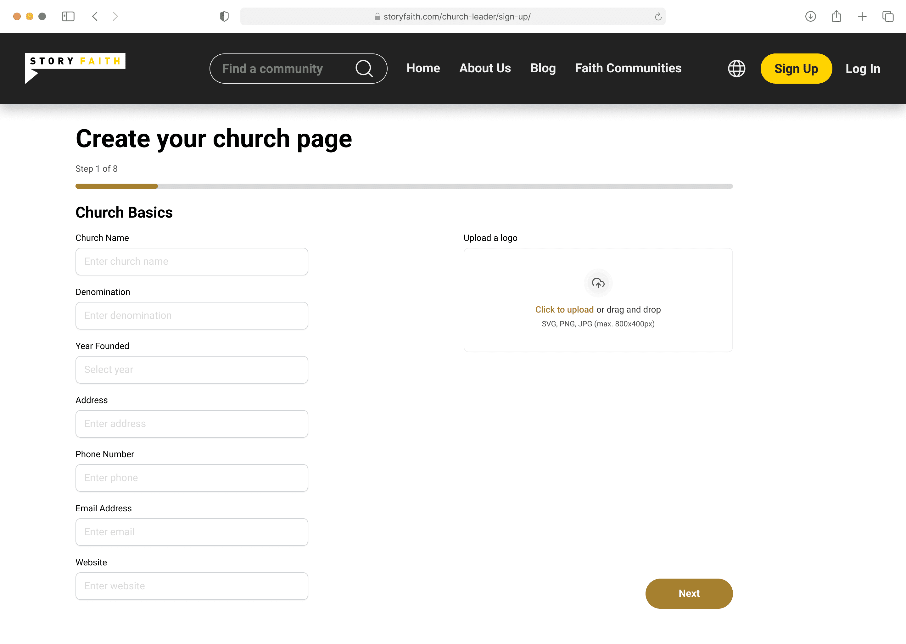
Personalized Pathways — An onboarding flow that asked meaningful questions about the user’s spiritual season, struggles, and availability.
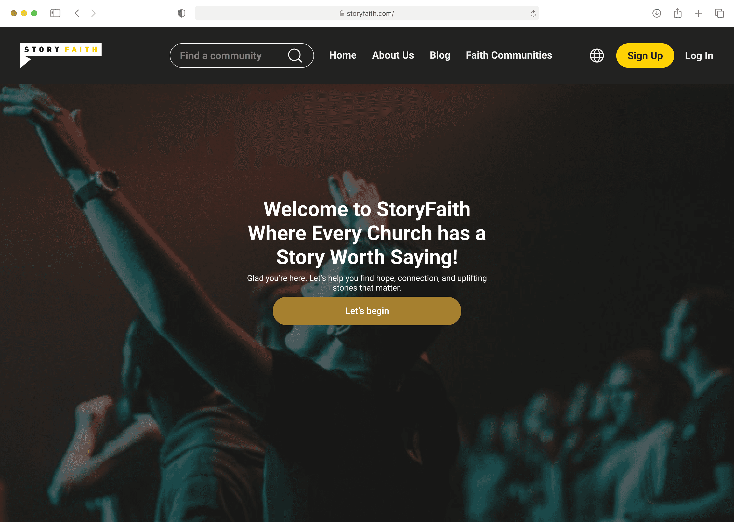
Sacred Stillness Hub — A calm, distraction-free home screen that curated daily practices, scripture, and reflection prompts tailored to the user.
Gentle Guidance — Notifications that felt like personal invitations, not pings — written in a tone of care and encouragement.
Balancing Inspiration with Usability
Visually, I stripped away unnecessary noise, opting for soft colors, generous white space, and typography that invited slow reading. Navigation became bottom-tab based, with the “Hub” always one tap away. I made sure every component aligned with Storyfaith’s design system so the team could scale the experience without rework.
The Result
The redesigned app transformed from a content repository into a daily companion for spiritual growth.
Higher Retention: Users returned more frequently to engage with their personalized hubs.
Increased Reflection Time: Average session duration rose as users spent more time with curated content.
Stronger Brand Connection: Feedback highlighted how the app now felt “calm,” “purposeful,” and “aligned” with the mission of the church community.
Year
2025
Client
StoryFaith
Services
Strategy, Roadmapping, UX Design, UI Design